Introduction
Getting Started
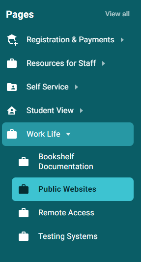
- Log into the MyVCCCD Portal
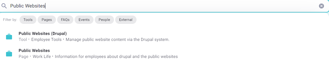
- Scroll down to the "Work Life" Tab on the left-hand menu and click "Public Websites" -or- search for "Public Websites" and click on the "Public Websites (Drupal)" listing.
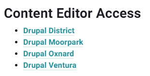
- Once on the "Public Websites" Portal page, look for the section called "Content Editor Access".
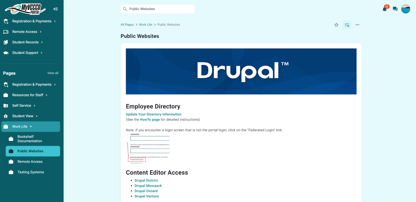
- Click on the respective Drupal link for your location (ex. Ventura College will click on "Drupal Ventura")
Navigating Drupal
The Drupal CMS will feature two tool bars at the top of the screen. The Black (or Green if you are a site editor or above) bar is where you can find options to either log out of Drupal, or hide/show the toolbars by clicking on the "Manage" Button.
The White Toolbar with the "Drupal Teardrop" logo is your primary editing toolbar. This tool bar has the following options:
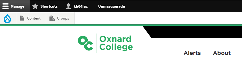
- Content - View and Create content in Drupal
- Media (this section is to view media uploaded to Drupal, as well as to add media yourself)
- My Groups (NOTE: This option no longer works, you will want to click on the "Groups" button to view your groups)
- Groups - View your assigned Groups in Drupal
Page Types
Drupal is comprised of 4 different page types.
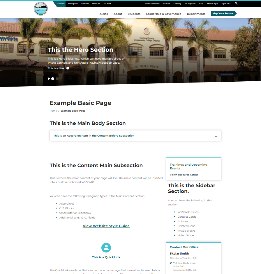
- Basic Page - Almost every webpage on our sites are a Basic Page. A Basic Page is comprised of a Hero Section, Main Content Section, Full-Width Bottom Section, and a Sidebar Section with a Global Group Menu.
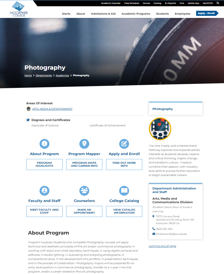
- Program Page - Program Pages are very similar in structure and appearance to a Basic Page. However, they are designed with extra features with Academic Programs in mind, such as information on Degrees/Certificates offered, Guided Pathways Meta Majors, and QuickLinks to sections of the page, as well as tools such as the online catalog, Program Mapper, Apply and Enroll, and more.
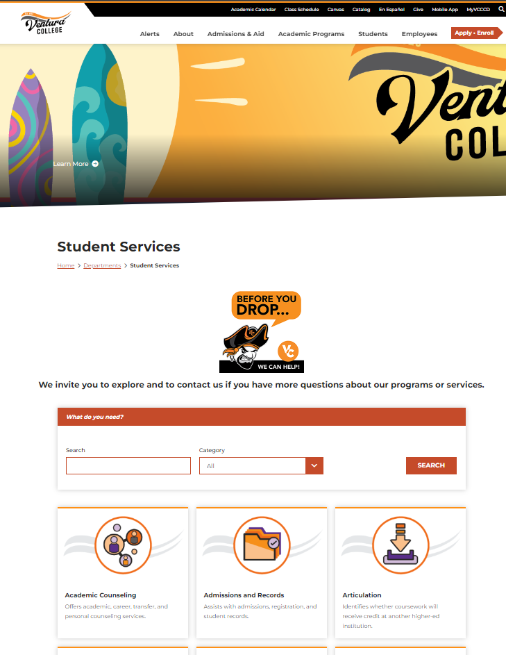
- Landing Page - Landing Pages are very noticeable, as they do not have a sidebar section, and the content fits the full width of the page. This is because Landing pages are designed to be jumping off points, and helping users to find information and then be quickly sent to another page with more information. An example would be the colleges' Student Services Page that has a custom search grid of all student services offered.
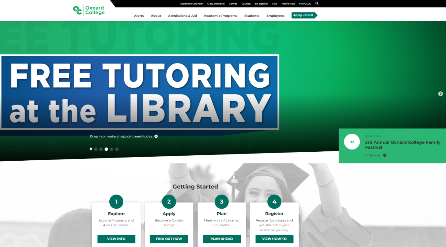
- Home Page - These are the main and first page of each website. The Home Pages offers information that is related to getting started, as well as any upcoming events and latest news and updates. The Home Pages are updated by each locations' Marketing Offices.
Drupal Groups
The Drupal CMS is structured in a series of Groups. Each group is home to nodes (pages), and menus tied to that specific group. In order to edit a specific page and/or menu, you will have to be given access to the group that they exist under. An example of this would be if you worked in the college library, and you are assigned to make edits to the textbook lending page. In order to make edits to that page, you will have to be granted access to all other pages that lives under the Library.
- To begin working in your assigned group(s), you will go to the white Drupal tool bar above, and click on the "Groups" button.
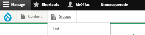
- You will then be taken to a page listing the Groups that you have access to in Drupal.
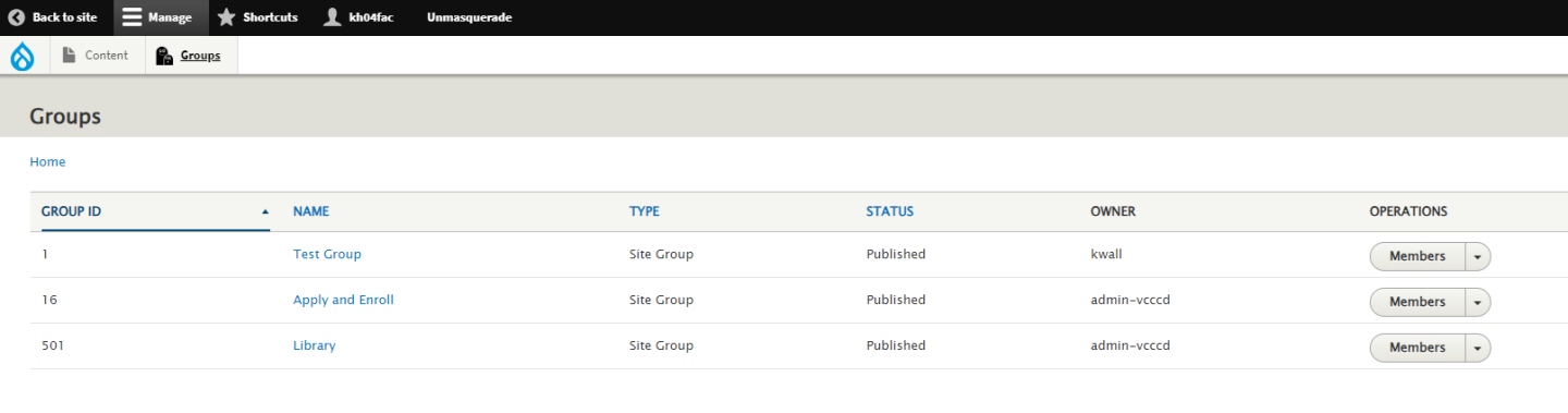
- To view the pages associated in a group, click on the name of the group you wish to view pages in.
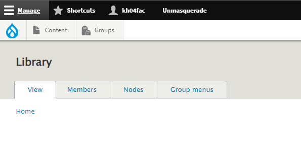
- The Group's options page will then load. You will notice tabs at the top of the page. To view the pages listed in that group, click on the tab called "Nodes".
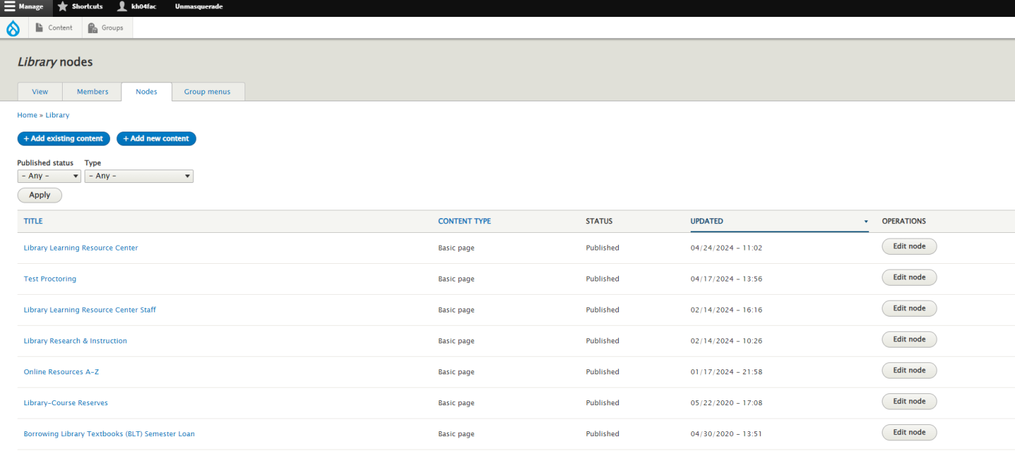
- You will then be taken to the list of nodes for that page. See the page you wish to edit? You will then click on either the name of the page to see the live preview before editing, or click on the "Edit node" button the the right of it to go straight into the page editing screen.
Editing Content
- Edit Screen and Options
- How to Edit an already existing Item
- How to Save a Page (Draft, Archived, Published)
- Note about Deleting pages
- Working with the WYSIWYG
- Embedding Photos and Documents
- Linking to Documents
- Embedding Videos
Applying Accessibility
When it comes to applying Accessibility to a webpage, always refer to the LIST workflow.
- Links - When using links, use descriptive and meaningful text to indicate where the link will go.
- Images - When using images, include descriptive and meaningful alternative text to support assistive technology users.
- Heading Styles - When creating topics, categories or sections, use heading styles to make content identifiable and navigable..
- Tables - When using tables, include a caption and the appropriate header row or column header, the caption acts a summary and the headers provide context to the table cells.
- Accessibility Checker -Use an accessibility checker to identify Links, Image Alt Text, Heading Styles and Table elements on a webpage.
Understanding the LIST Workflow
Links
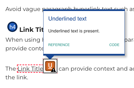
It is important to provide descriptive and meaningful paragraph text for hyperlinks because it allows website visitors to know where the link will go.
Avoid vague paragraph hyperlink text such as "click here."
Link Title
When using Hyperlinks in the main body paragraph text, include a Title to provide context for the link.
The Link Title can provide context and ad addition information about the link.
Images
When embedding images, include descriptive alternative text.
Alternative Text is beneficial for website visitors using a screen reader.
The Alternative Text or Alt Text is a an invisible description of the image, allowing blind or low vision website visitors to perceive and understand the content.
Styles
Heading Styles make content easy read and navigate.
When creating new topics, categories or sections, use a brief descriptive Heading Style to make the text stand out.
Easily scan down a webpage and understand an outline of the page when Heading Styles are used.
Screen Reader users can also utilize the Heading Styles to navigate through the page, similar to someone visually scanning down the page with their eyes.
Tables
Tables can be a useful way to display content, beside to include a table caption and appropriate table headers.
Table Caption
The Table Caption is a summary for the content.
The Caption also allows Screen Reader users to easily identify the purpose of the information in the Table.
Table Header
If appropriate, include a Table Header for the top row, first column or both.
The Table Header will apply a dark background to the cells, making the content distinct.
The Table Header also provides contextual support for Screen Reader users, when navigating through rows and columns, the header cell will be spoken before the data cell, making the Table easy to understand.
Paragraph Types
There are a variety of Paragraph Types available to add onto a basic page. The different types are as follows:
- Accordion - A expandable and collapsible container that can hold information in the form of either a WYSIWYG, a Selected People list, or a Person List (Manual).
- WYSIWYG - short for "What You See is What You Get", this is the basic content editing block for Drupal pages.
- Flexible CTA Blocks - Call to Action Blocks that highlights a Thumbnail, Title, Caption, and list of links. You can have up to four of these blocks in a row in the Content Main Section, or up to six in a row in the Full Width-Bottom Section.
- Flexible CTA Blocks (Links) - Same as the Flexible CTA Blocks, however without the need for thumbnails or captions.
- Small Interior Slideshow - A Slideshow element that can show various images, and/or YouTube/Vimeo videos as slides with the option for Title and captions on each slide.
- Audio Player - A Basic Audio Player that will play any mp4 audio file, as well as display a written transcript that you provide in a text field.
- QuickLinks - Button like links that can sit on a Basic page, and be used to either take a user to another page/site, or used as a Anchor Link, and can be pointed to scroll to a specific section of the same page upon clicking/tapping the Quick Link.
- Selected People - A section that can display employees bio/contact info from the Employee Directory. NOTE: Employees must be active, and not temporary (Provisional or Professional Expert) in order to be referenced in this Paragraph Type.
- Person List (Manual) - A manual entry version of Selected People. Used to manually insert a person's name, photo, and contact info if they are not in the Employee Directory. This Paragraph type can also be used as a person spotlight.
- Sidebar Contact Card - A card that can be populated in the Sidebar Section to display either a person, or office's contact information and office hours. This can also be used to show meeting times and location for a committee.
- Sidebar Buttons - A button that can be setup to point to a URL that you provide. These buttons appear on the Sidebar Section.
- Related Links - A card that can be populated in the Sidebar Section to display links to any URL that your provide.
- Sidebar Image and Video Blocks - A Block that can be placed on the Sidebar Section, that can either display a Image with a Caption Overlay, or a YouTube/Vimeo Video.
- Adjustable Media and Content Bar - A Bar that can be populated in the Full-Width Content Section, that comprises of a Title, Caption, Buttons pointed to URLs you provide, as well as either a Image or Video to Highlight.
- Full-Width Image Section - A Bar that can be populated in the Full-Width Content Section, that comprised of a full background image, a Title, Caption, and Buttons pointed to URLs you provide.
- Footer Banner - A Bar similar to the Adjustable Media and Content Bar, however instead of a highlighted image or video, shows a space for a icon, and buttons that you can populate with URLs you provide. Designed to be more of a "looking for more info?" paragraph type to be used at the very bottom of the page.
Managing Pages
Sidebar Navigation Menus
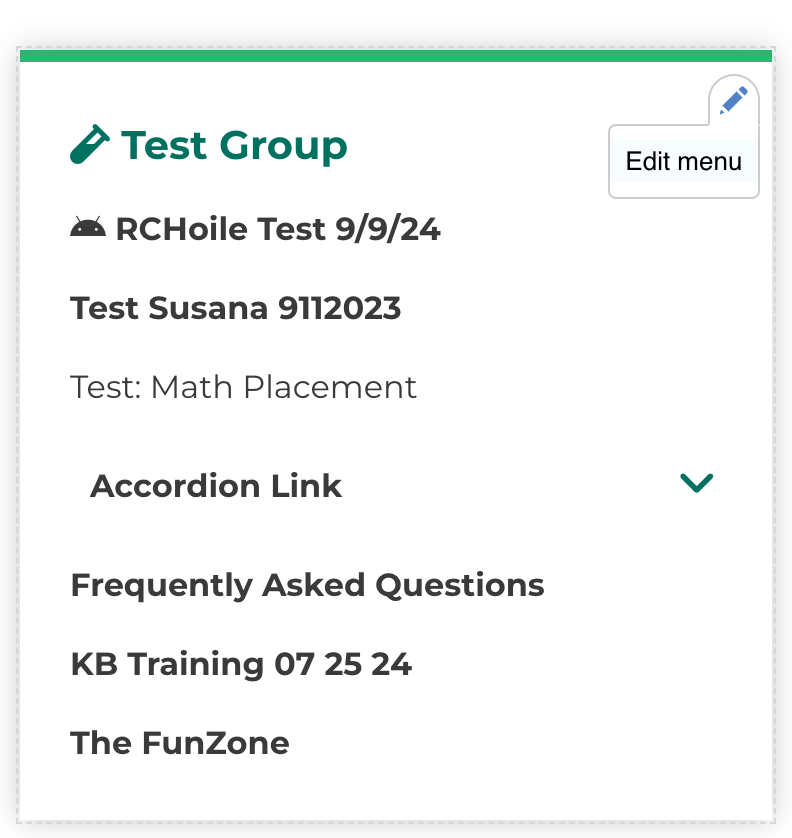
To edit a Sidebar Navigation Menu, you will want to hover over the menu. Once hovering, a pencil icon will appear on the top right of the menu block. You will then click on the pencil, then click on Edit Menu.
You will then be taken to the editing screen for the navigation menu. You will notice that some links have checkboxes checked, and others don’t. The checked ones means that those links are live and accessible in the menu. The ones that are not checked means that they are disabled or hidden from appearing in the menu.
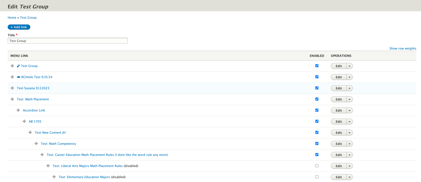
You will also notice that some of the links are offset to the right. That helps in organizing sub menu links. The more a link is pushed to the right using the crosshairs next to the link, then those links will then become collapsable/expandable.
To edit what a link says, or where it points to, you will click on the edit button to the right of the link. From there you will be taken to a screen where you can edit the name, URL, and even add an icon to it if you wish to have one.
Locks on Pages
Drupal does not allow simultaneous editing. This means that you and someone else cannot be editing the same page at the same time. Whoever goes into the page first is the one who has locked it from other users who have access.
If you are editing a page and want to make sure that others can edit the page after you, you will either:
Click Save, and save as either published or draft to save your changes
Click Unlock, and break the lock and leave the page if you made no changes
Sometimes users can forget to unlock the page when not saving the page or clicking the unlock button. If this happens to you, Drupal will show you the user who has it locked. Simply add “@vcccd.edu” to the end of their user name and email them asking if they can break the lock. If they are unable to break the lock for any reason, then you will want to submit a online marketing request to have the lock broken for you by your location’s marketing team.
Creating new pages in your Groups
Creating new pages in your assigned Groups is simple.
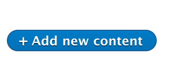
You will want to navigate to your Groups section, then go into the group you wish to add a new page to. You will then click on the Nodes tab. Once on the nodes page, you will then click the blue button called Add New Content.
Then select the type of page you wish to create.
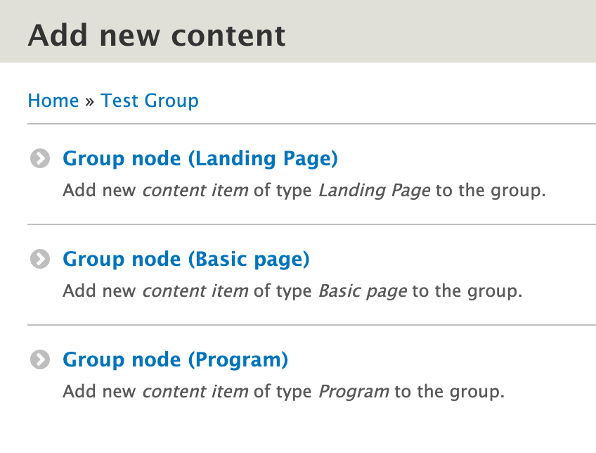
You will then be taken into the page editor for the brand new page.
Ensuring Accessibility
When reviewing content for accessibility, use an accessibility checker.
WebAIM offers a free browser extension to check the accessibility of a web page, it is called WAVE.
WAVE
The Web Accessibility Evaluation Tool is available as a web browser extension for Google Chrome and Mozilla Firefox.
Wave can also be used as a stand alone website, just paste a URL and begin checking.
Evaluating the Check LIST
The WAVE accessibility checker identifies elements on a page with an inline icon.